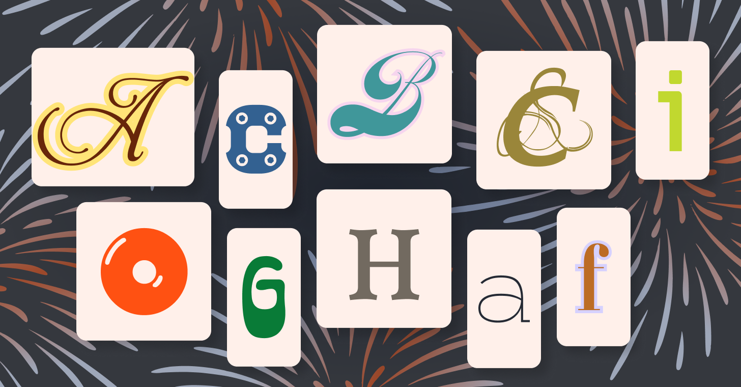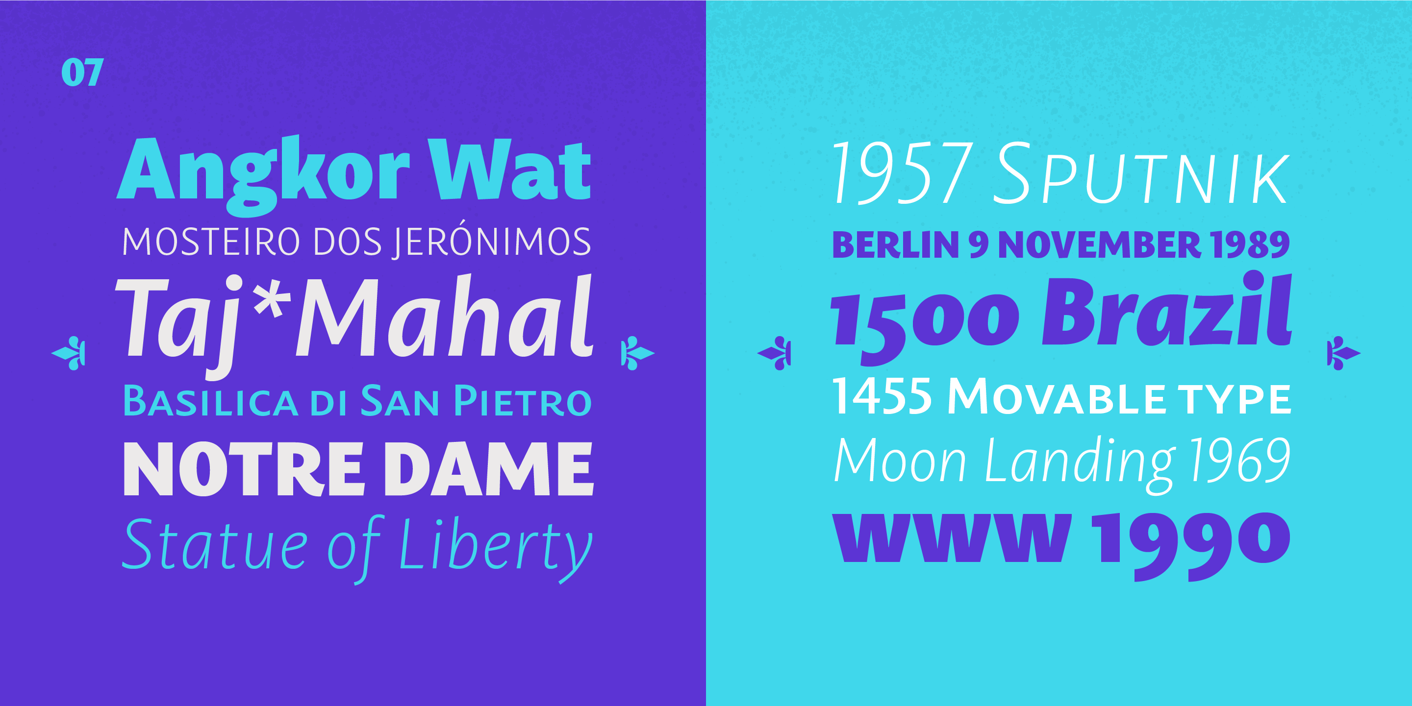
Some fonts stop you mid-scroll. Others quietly earn your trust the more you use them. This roundup has both: nine typefaces spanning blackletter, scripts, serifs, and display styles, each with something genuinely worth your attention. Whether you're working on a brand identity, editorial layout, or a label that needs personality, there's something here for you.
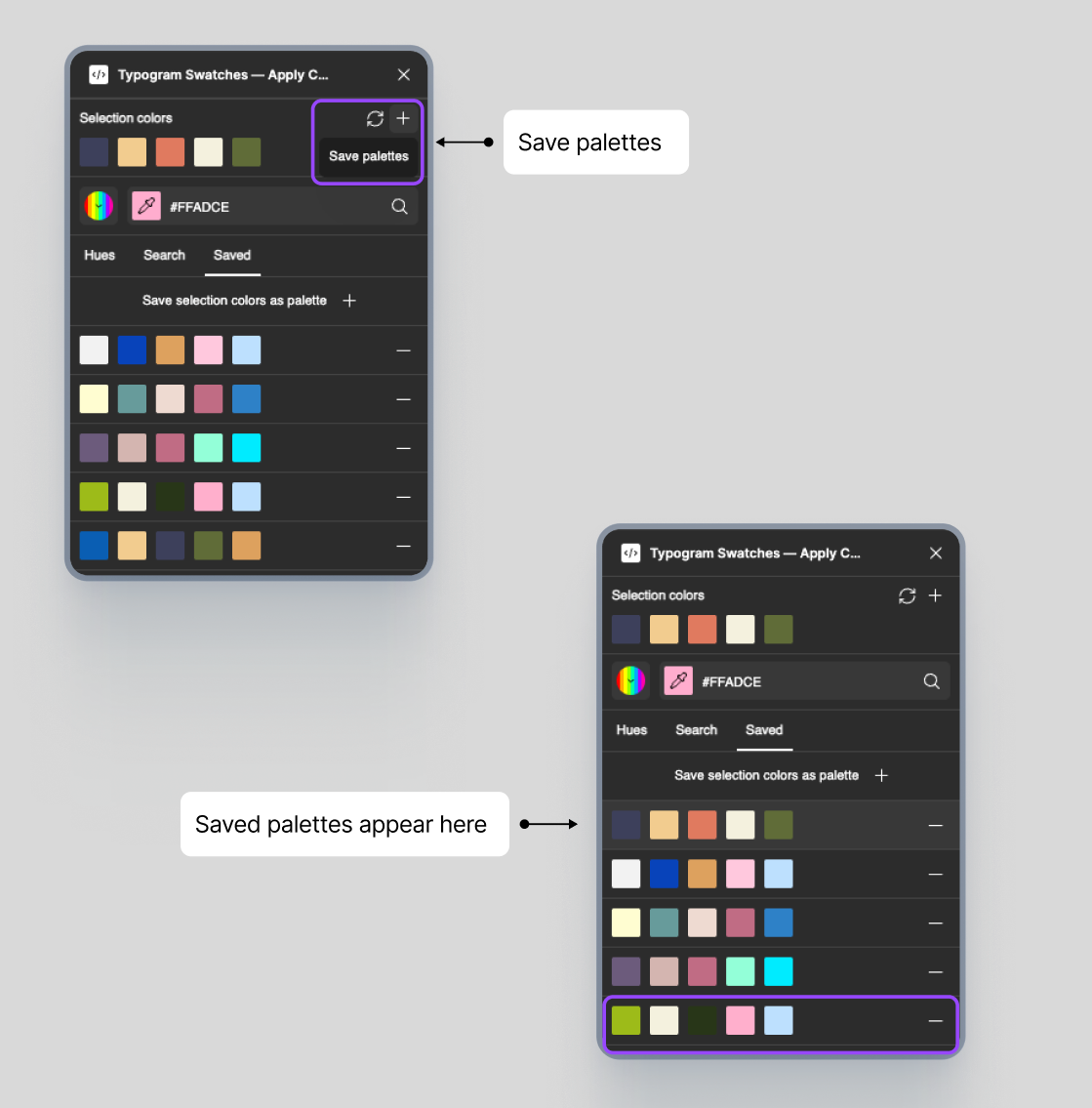
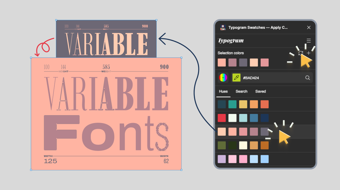
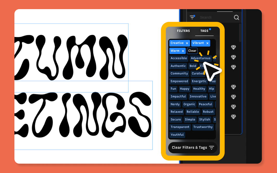
Typogram Studio offers a rotating collection of free premium fonts for designers through our monthly font freebie calendar. Each release features a carefully curated display or text typeface you can use in personal or commercial projects. Bookmark our freebie font calendar to discover new high-quality fonts added every month.
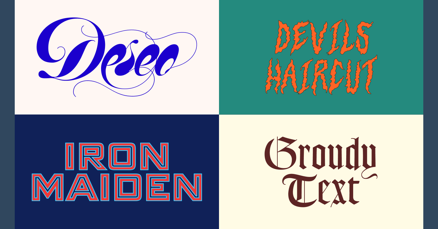
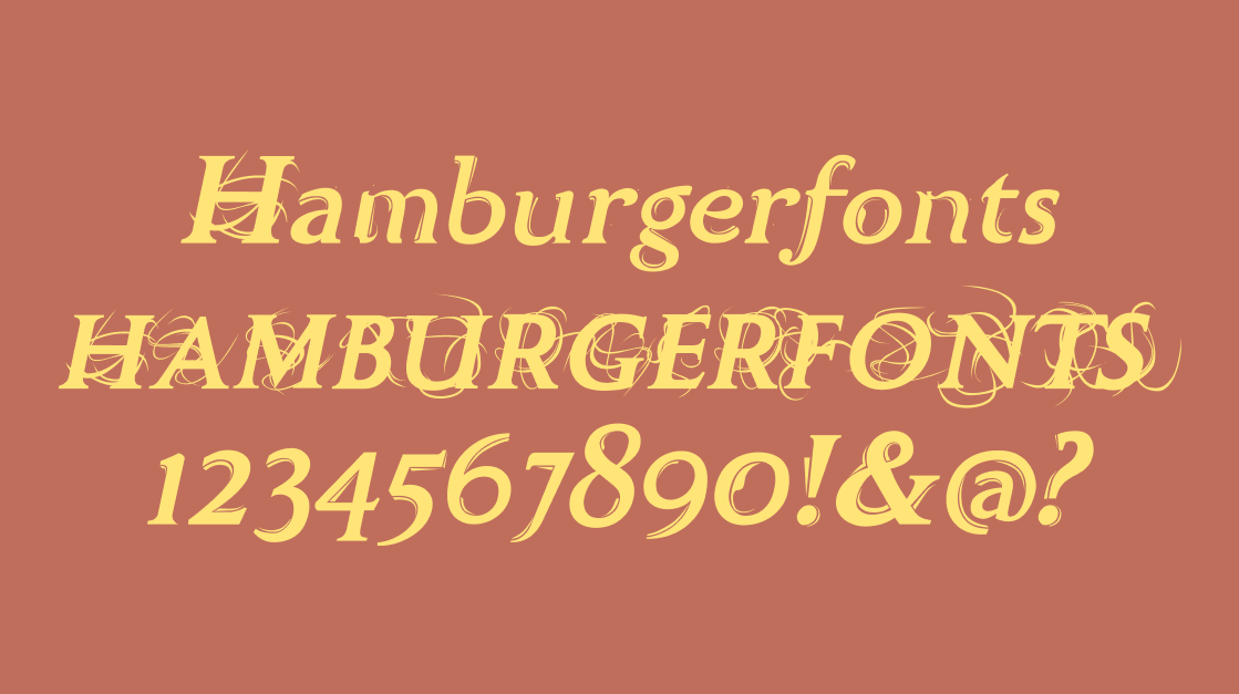
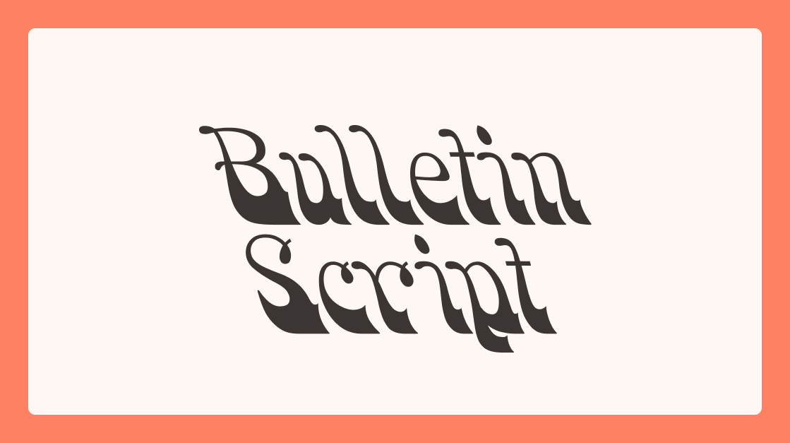
Bulletin Script
HWT Bulletin Script revives a classic 19th-century American wood type tradition, and it does so with full conviction. The flowing, sign-painted letterforms bring mid-century Americana to the table: the casual confidence you'd find on a vintage storefront or a hand-lettered broadside. It's ideal for nostalgic posters, retail branding, and packaging that needs to feel like it has a history. Pair it with a wide condensed sans for contrast, or let it anchor a logo that needs to feel both handmade and designed.
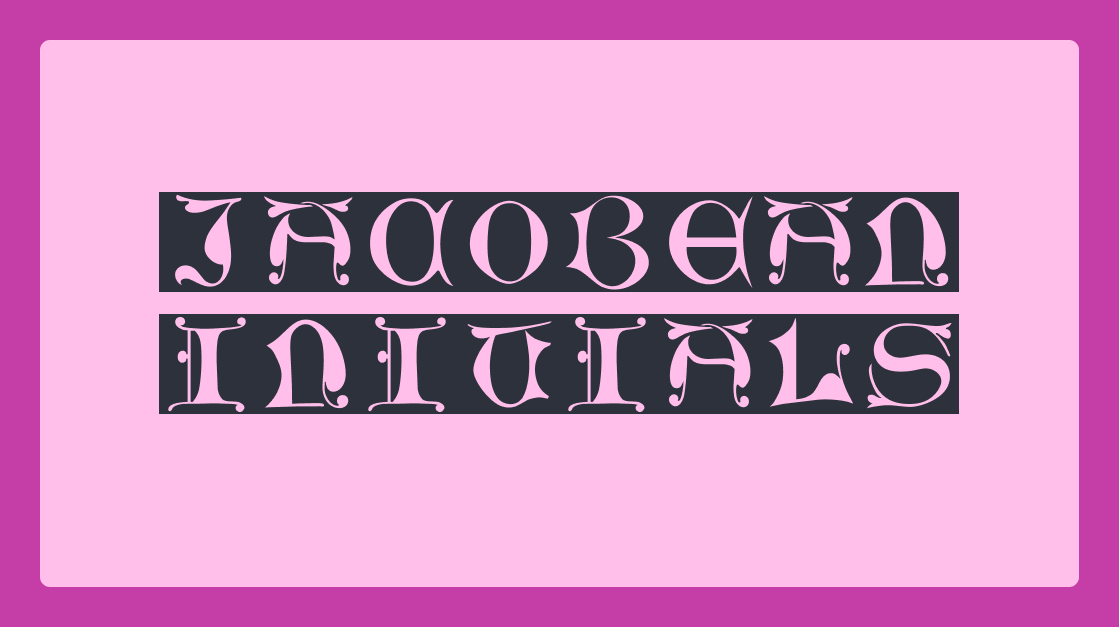
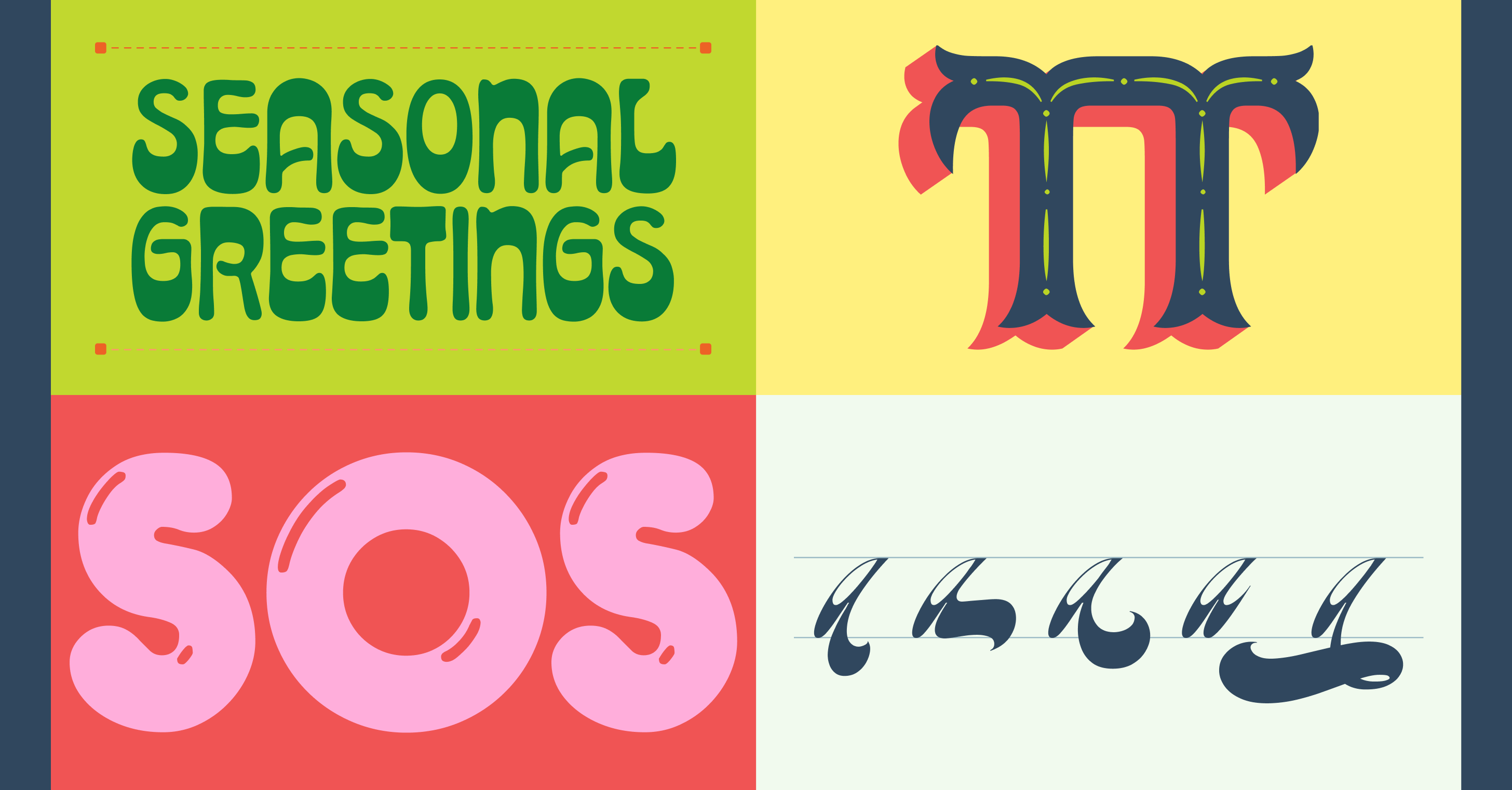
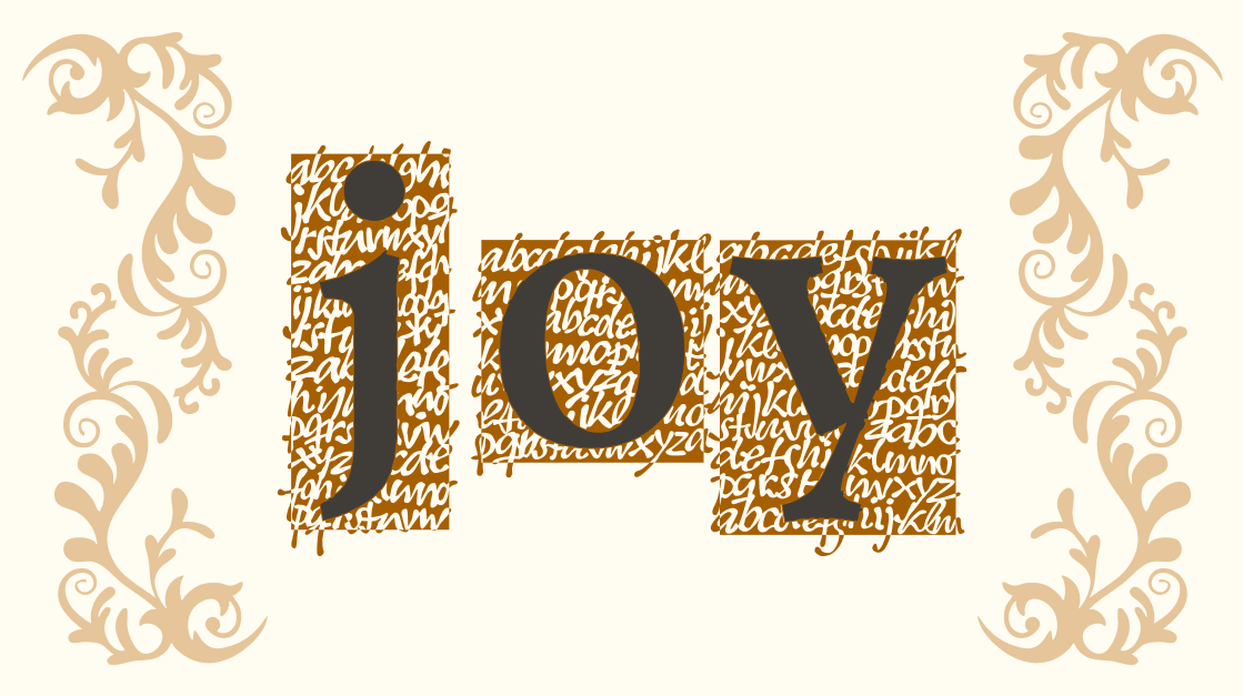
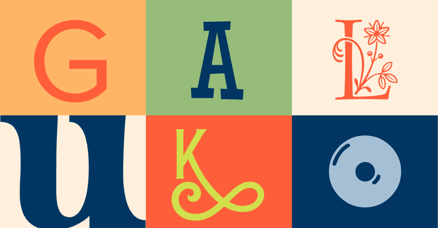
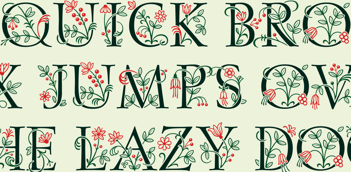
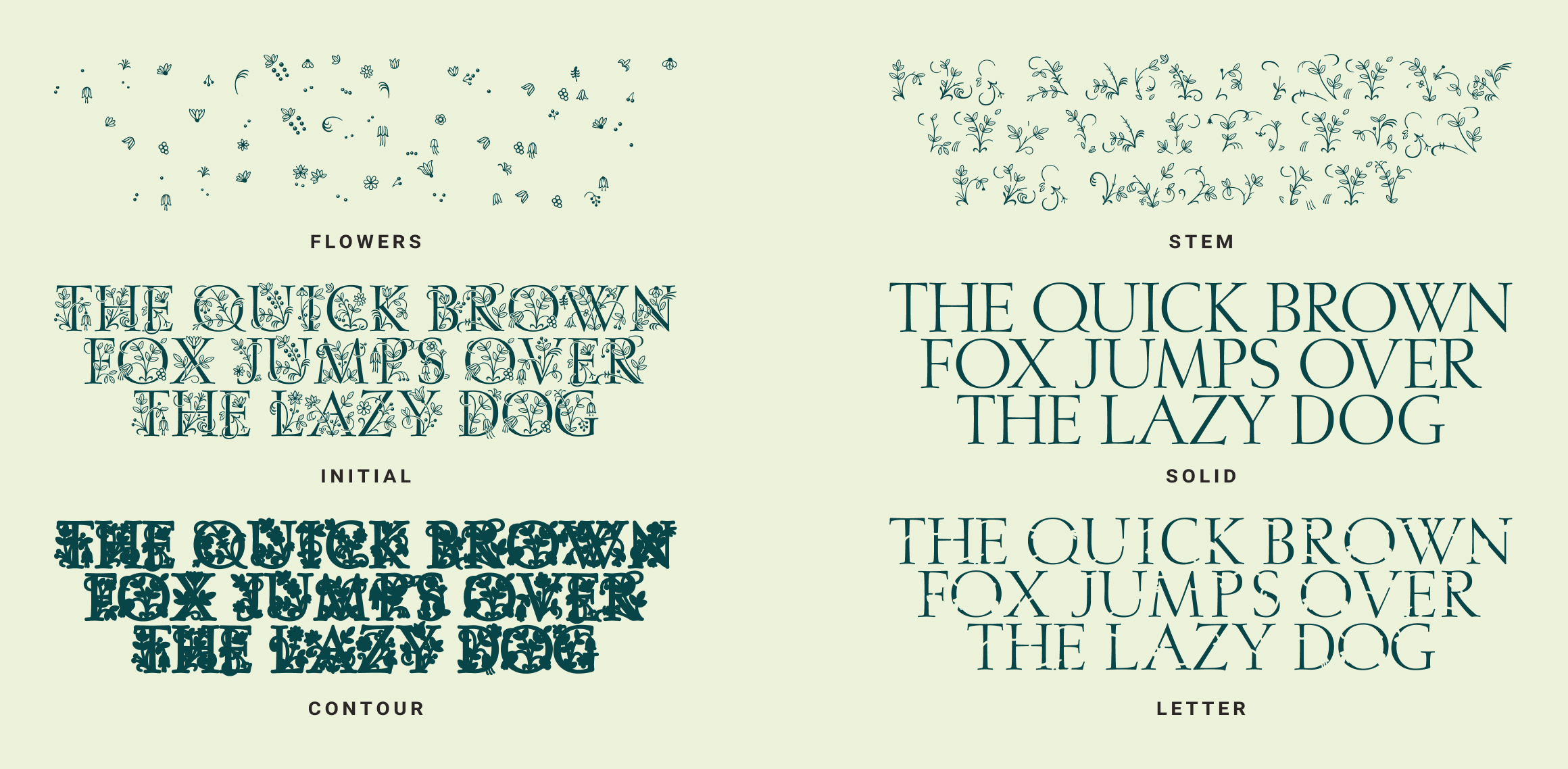
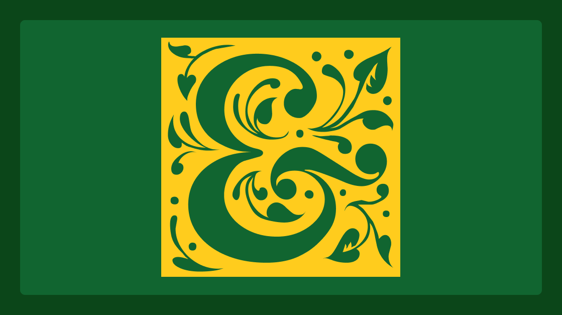
Jacobian Initials
Drop caps aren't just decorative. They're an invitation to read. Jacobian Initials gets that assignment completely. These ornate initial capitals come in framed and unframed styles with four-layer color options, carrying the energy of illuminated manuscripts while staying versatile enough for modern applications. Use them on stationery, food labels, album covers, or anywhere an opening letter should feel like a moment. Pair with a simple, generous body font and let them command the page.
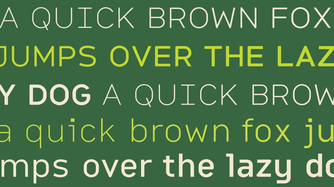
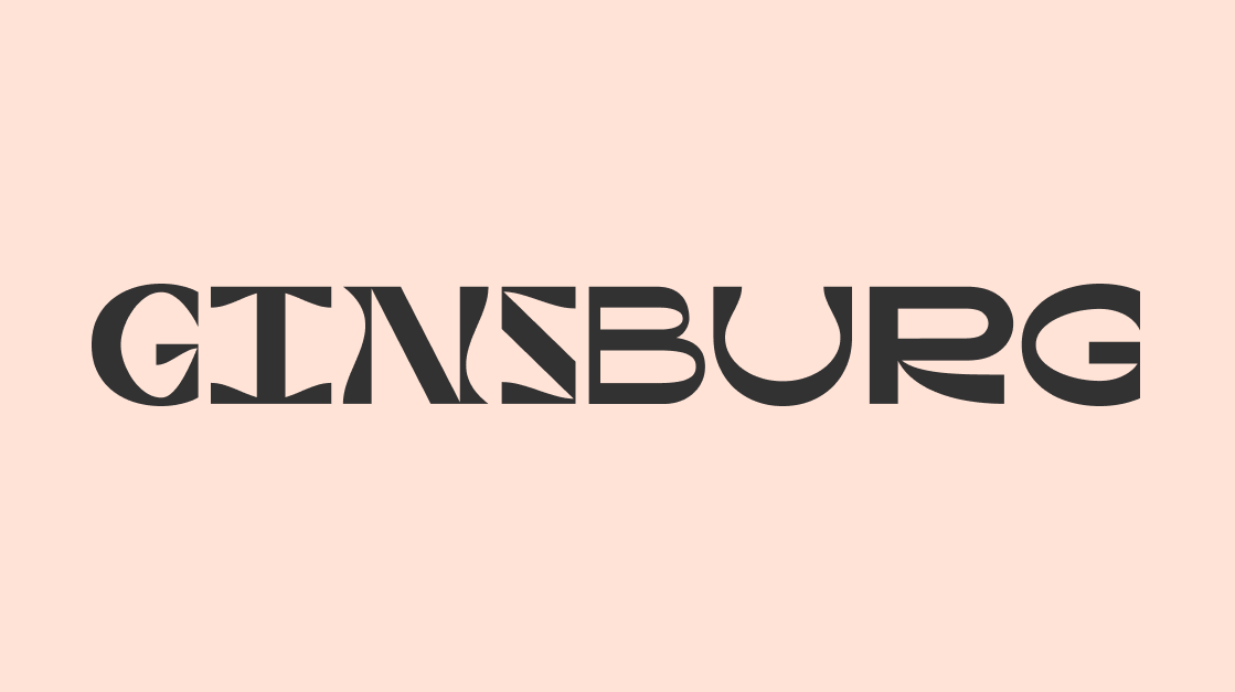
Ginsburg
Ginsburg isn't your usual sans-serif. This modern all-caps display font brings geometric shapes and wavy lines together with a set of alternates that let you tune the energy: restrained or expressive, your call. It has the kind of graphic confidence that translates well to TV title cards, podcast covers, and bold poster work. When the brief calls for type that looks designed rather than just chosen, Ginsburg delivers.
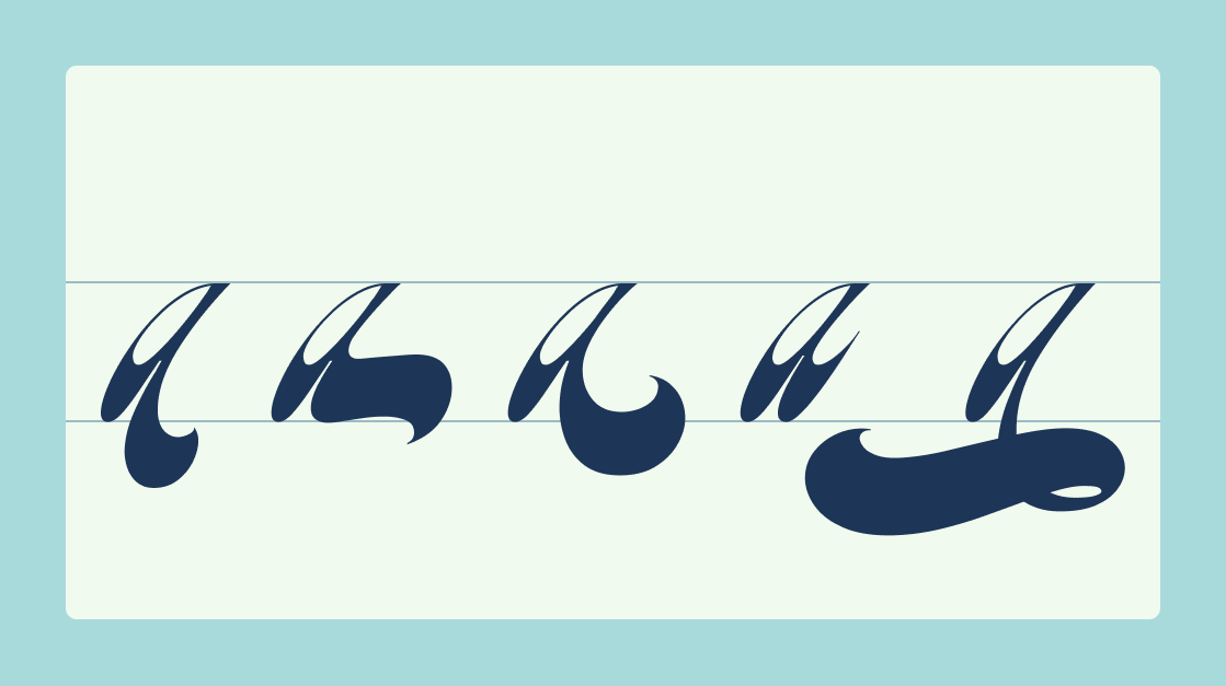
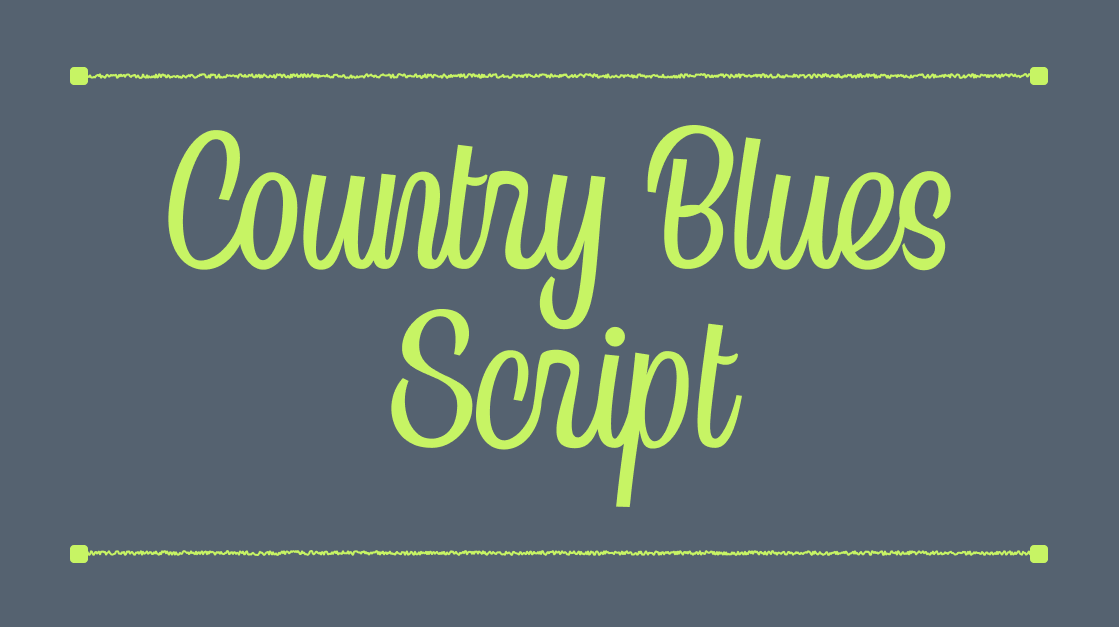
Country Blues Script
Country Blues Script is rhythm you can see. Inspired by vintage vinyl covers, retro sports culture, and rock 'n' roll, this script brings lively energy through alternate capitals and unique lowercase forms that keep every word feeling alive. The result is a typeface that works beautifully on album art, badges, and textured retro branding. Anywhere the design needs to feel like it came up through a subculture rather than off a shelf.
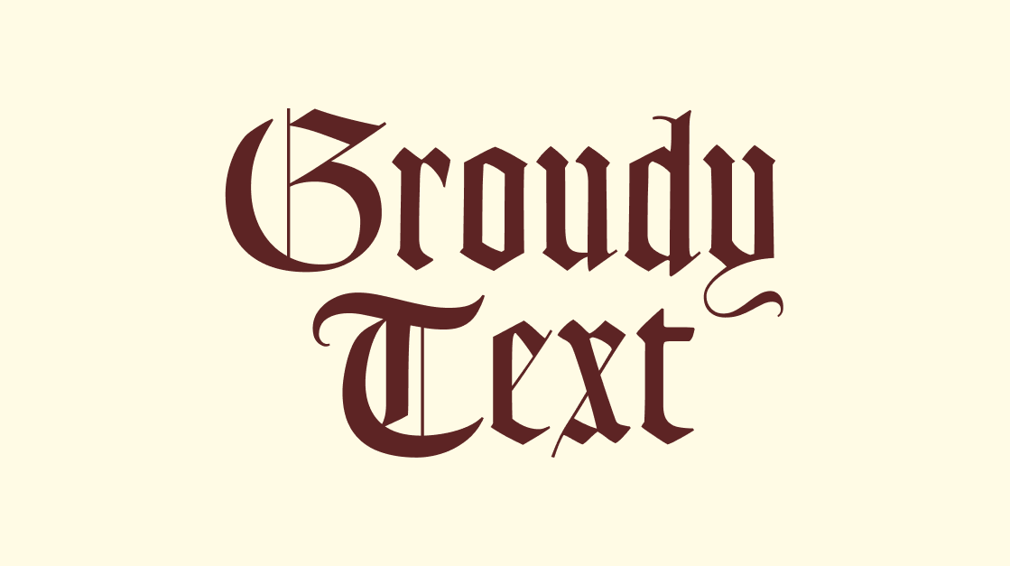
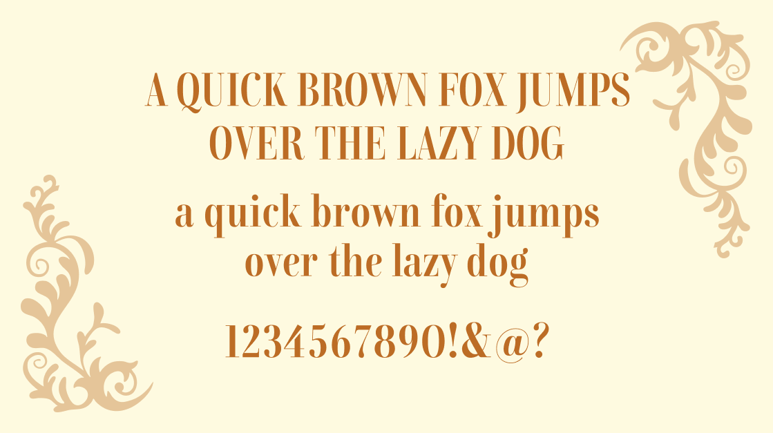
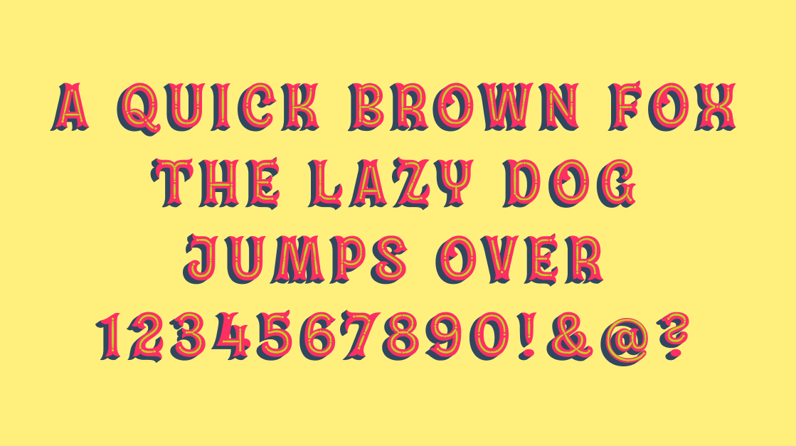
Goudy Text
There's a reason blackletter never fully goes away. Goudy Text taps into that centuries-old tradition with a scholarly weight that feels both historical and surprisingly fresh. The letterforms have real structure to them: angular, deliberate, confident. Use it for headlines that need gravitas, or as a contrast element against a clean sans-serif. It's the kind of typeface that makes a logotype feel like it was earned.

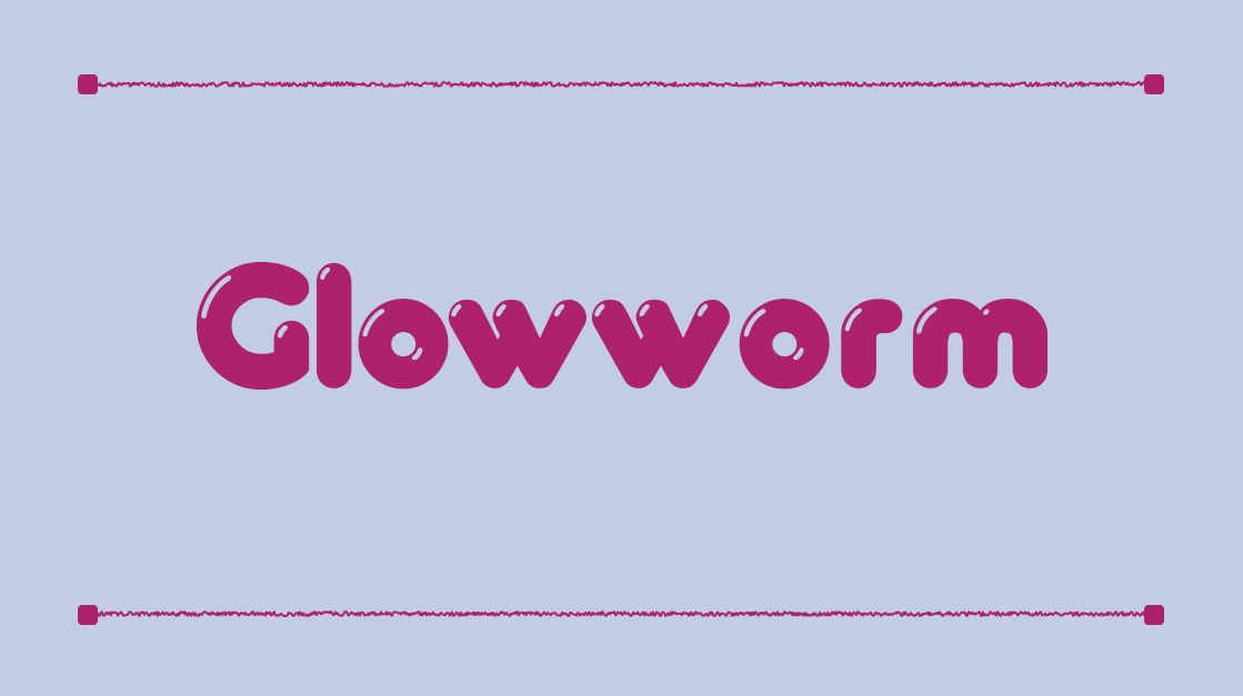
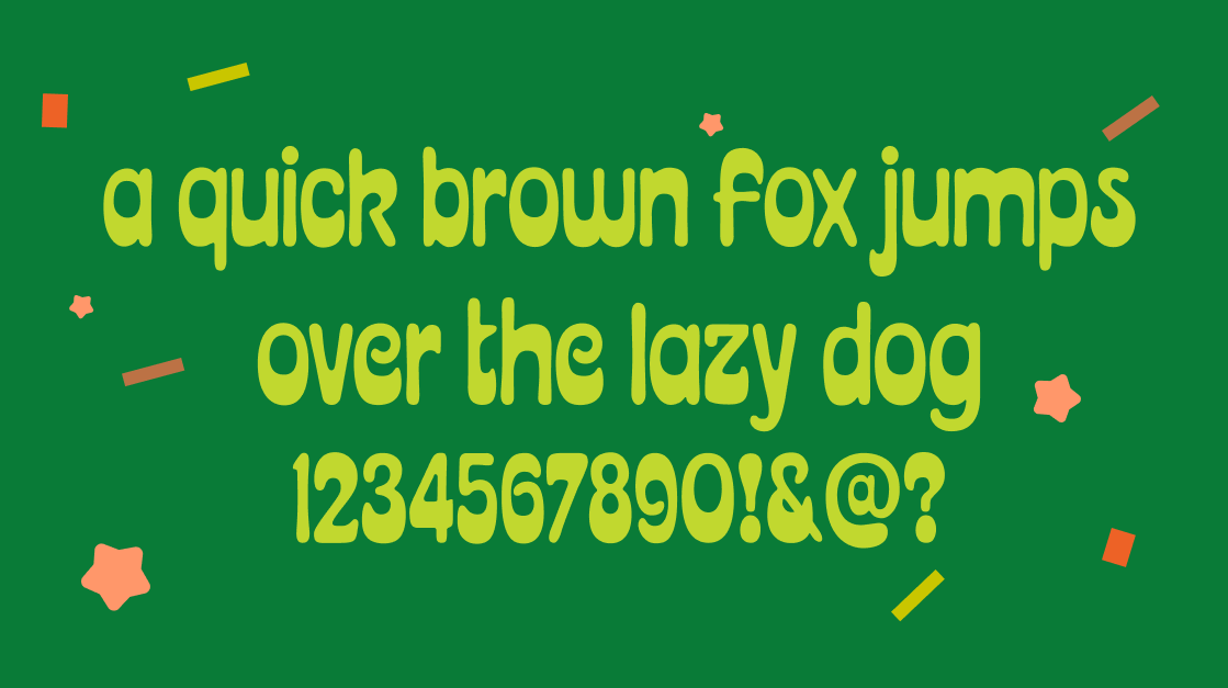
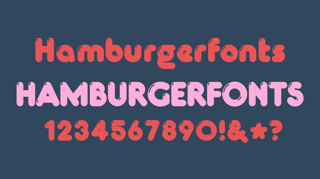
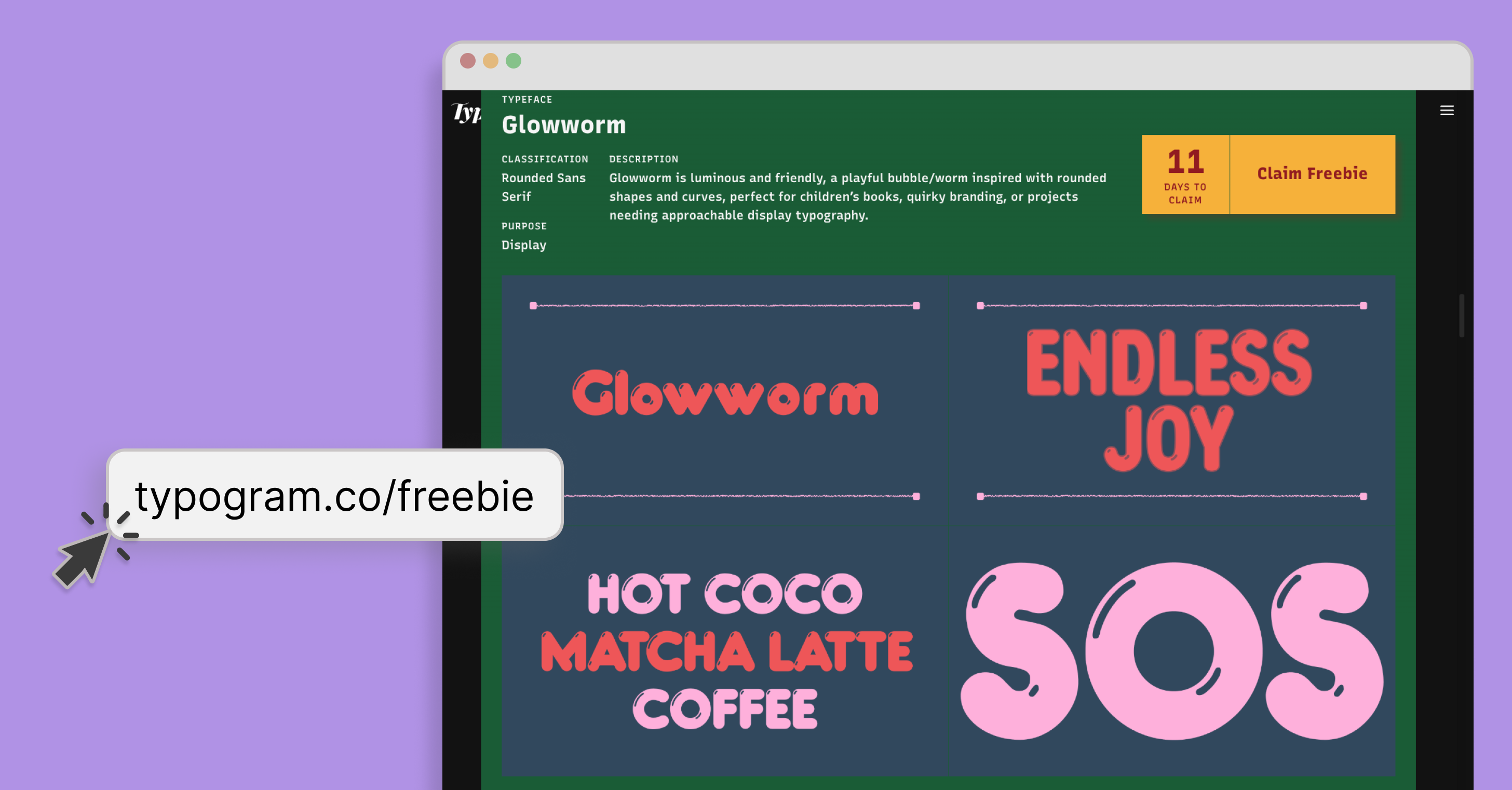
Glowworm
Soft, rounded, and full of life. Glowworm earns its name. Inspired by bubble and worm forms, its curves feel genuinely playful without tipping into childish. It's a natural fit for children's books, quirky branding, or any project where the typography needs to say approachable before a single word is read. Display sizes are where it really opens up: the rounded strokes catch the eye and the friendly personality lands immediately.
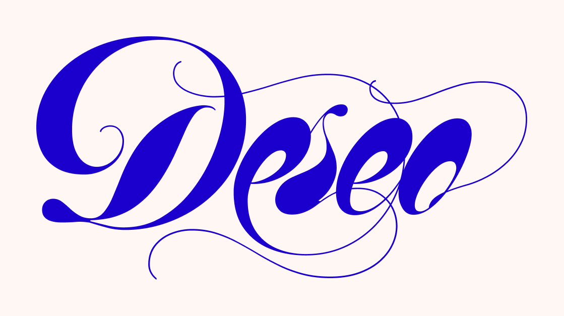
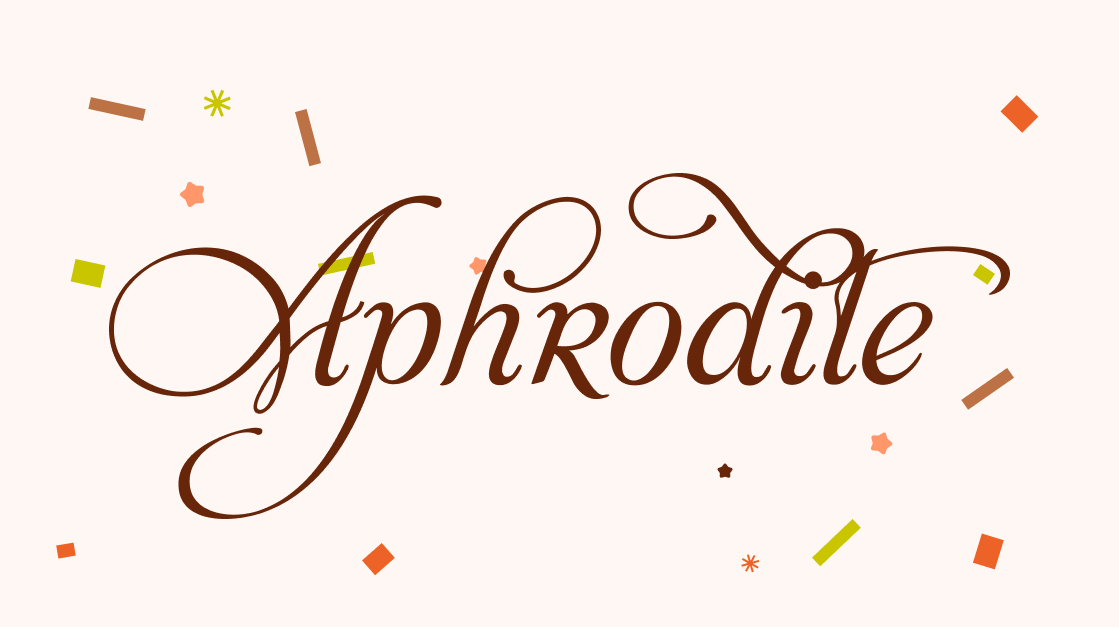
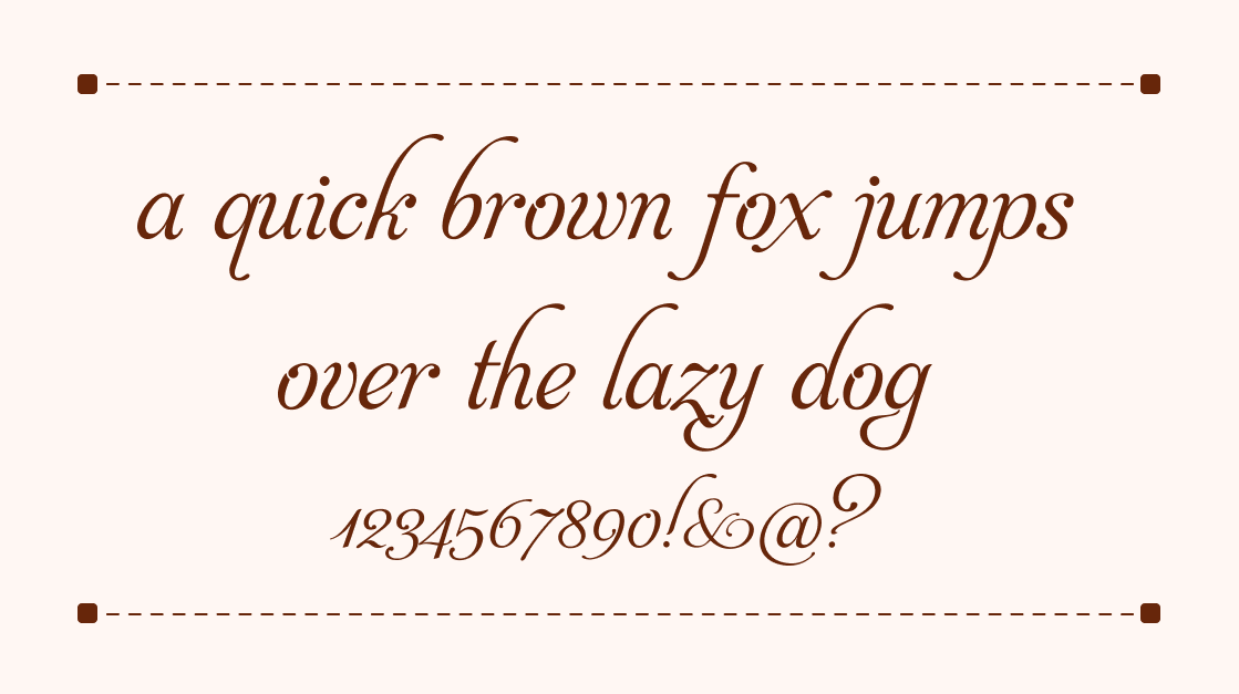
Aphrodite
Aphrodite is a script that knows exactly how elegant it is, and earns every bit of it. The flowing curves and classic proportions carry the sophistication of high-end stationery and luxury packaging, without ever feeling overdone. It's the kind of typeface that makes a headline feel like it was written, not set. Reach for it when the brief includes words like refined, timeless, or elevated.
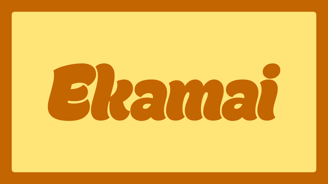
Ekamai
Ekamai brings warmth and charm in equal measure. This friendly, plump script balances soft, playful curves with enough polish to work across real design contexts: food packaging, magazine headlines, logo wordmarks, and branding that wants to feel handcrafted without looking rough. It sits in that rare space between casual and considered, which makes it incredibly versatile. If your project needs a handwriting-style font that still feels professional, Ekamai is the one to reach for.
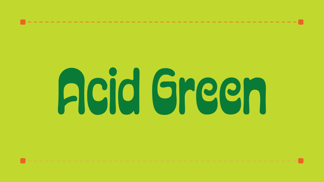
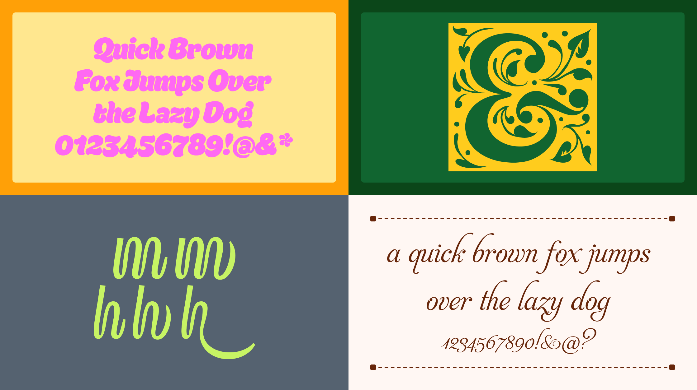
Acid Green
Acid Green doesn't ease you in. It arrives. Bold geometric shapes collide with psychedelic energy to create a display font that commands attention before the reader has processed a single word. It's built for projects that refuse to be ignored: experimental graphics, statement posters, and modern branding where subtlety was never part of the brief. If your design needs a jolt, this is it.
These nine fonts span centuries of typographic tradition and dozens of potential use cases, but what they share is a sense of intention. Each one was made by someone who cared about how letters feel, not just how they function.

You can claim them now through our monthly font freebie calendar and if any of these spark a project, we'd love to see what you make!
]]>